贴一篇之前公司内部讨论时的文章
第一名一致投票给国家地理的Logo
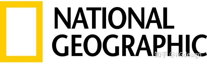
画个框而已,你会,我也会,找个80岁老头教他用用电脑他还是会。但是你做了这个logo甲方肯定不认可,甲方通过了也注册不了。这个Logo真正绝的地方不是技术,而是整套VI系统。Logo和主题的高度切合与可变性,确实很难想象还会有第二个同档次的作品。

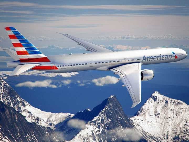
American Airlines,在如此简洁的结构里表达American与Airlines两个主题。辅助图形与实际应用也远超常规航空公司的水准。
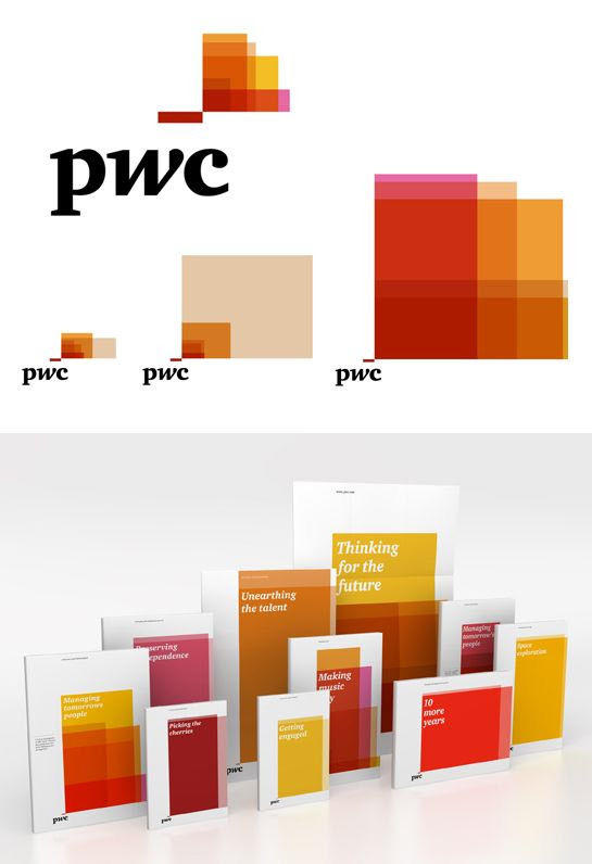
普华永道,一般人可能并不会认为这个Logo有多么出色,不过在我眼里这个Logo在辅助图形上拥有出色的延展性、一致的美观性与弱智都不会用错的简单结构。实在是非常难得。
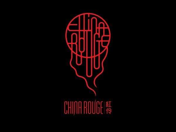
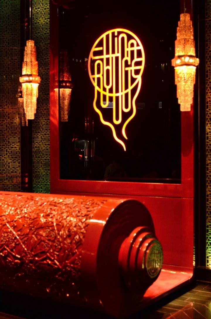
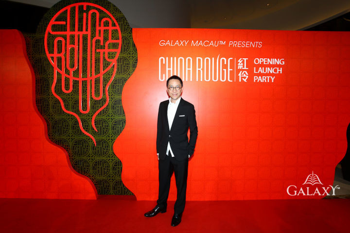
陈大师的红伶,这是我见过在中西两种风格上结合的最融洽的一款Logo
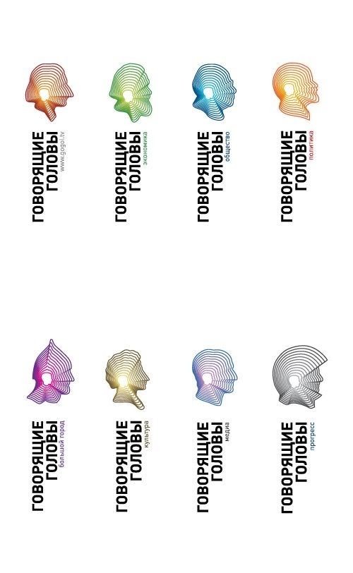
懂俄语,看不懂具体是什么品牌。但是我仍然震惊于这款Logo对人物形象的延展方式以及最后达到的效果。
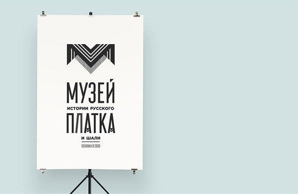
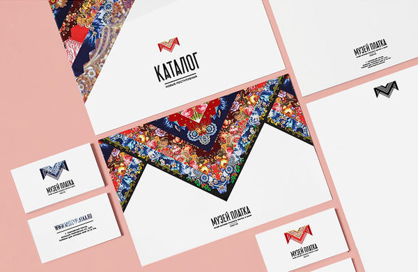
俄罗斯的披肩博物馆,毛子这种悍勇粗豪的民族却意外的能做出这么细腻的设计。这个Logo很好的将披肩的共性与个性恰到好处的展现了出来。延展方式也十分简洁直观。
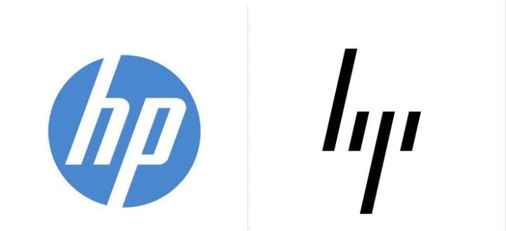
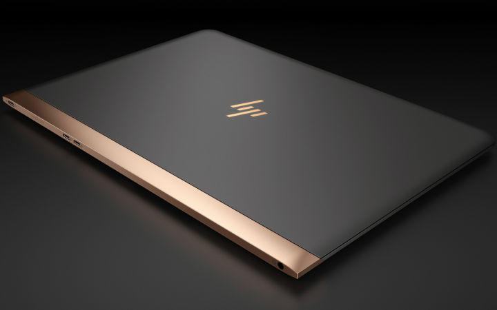
其实我在大概5年前就见过这个Logo了,记得是 Moving Brands 在自己品牌网站上的展示。看到这个Logo感觉像是看到了惠普这个品牌最终的形态,很符合改无可改四个字。而且惠普居然将这个Logo搁置了6年之久,据说是因为觉得不符合品牌调性,直到去年才拿出来用于自己的高端品牌上。也可以从侧面看出一个优秀的Logo是如何被蠢货埋没的。
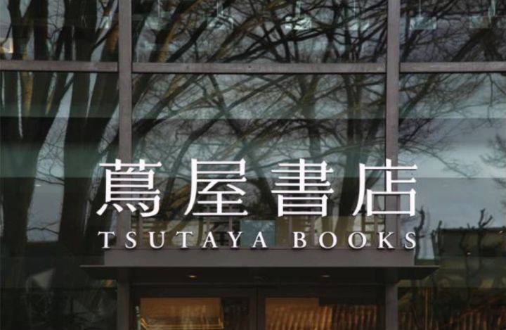
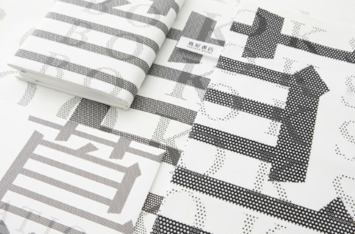
原研哉的茑屋书店。Logo本身是很平淡的设计,特制的明朝体,没有夸张的变形也没有特别的细节,但就是看着很协调,每一根线条每一处间隔都很协调。
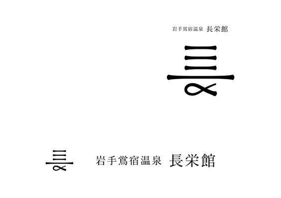
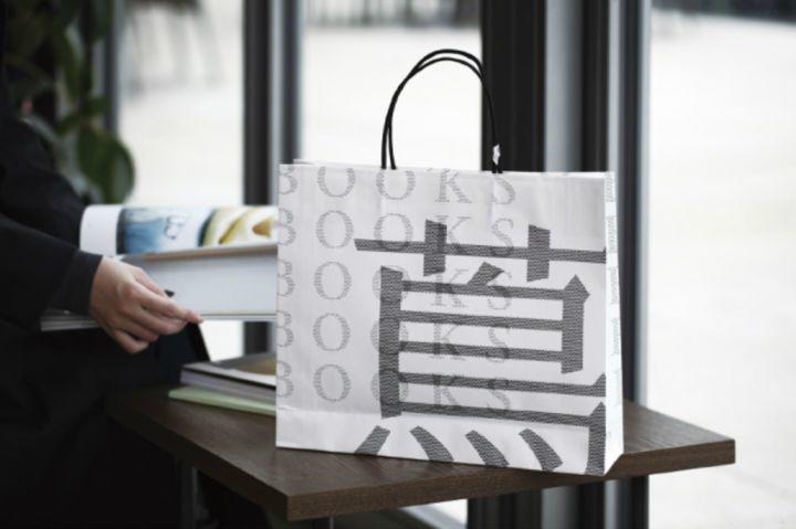
在看到这款Logo之前我完全不会想到将长字从这个方向去设计。十分协调、醒目,进行了大量的简化与变形居然还可以无障碍的识别。

白字的处理巧妙结合了行业属性,整体结构与搭配上也没有什么缺憾。
最后,如果你也想设计一个如此精致的品牌形象,可以尝试联系我们