·
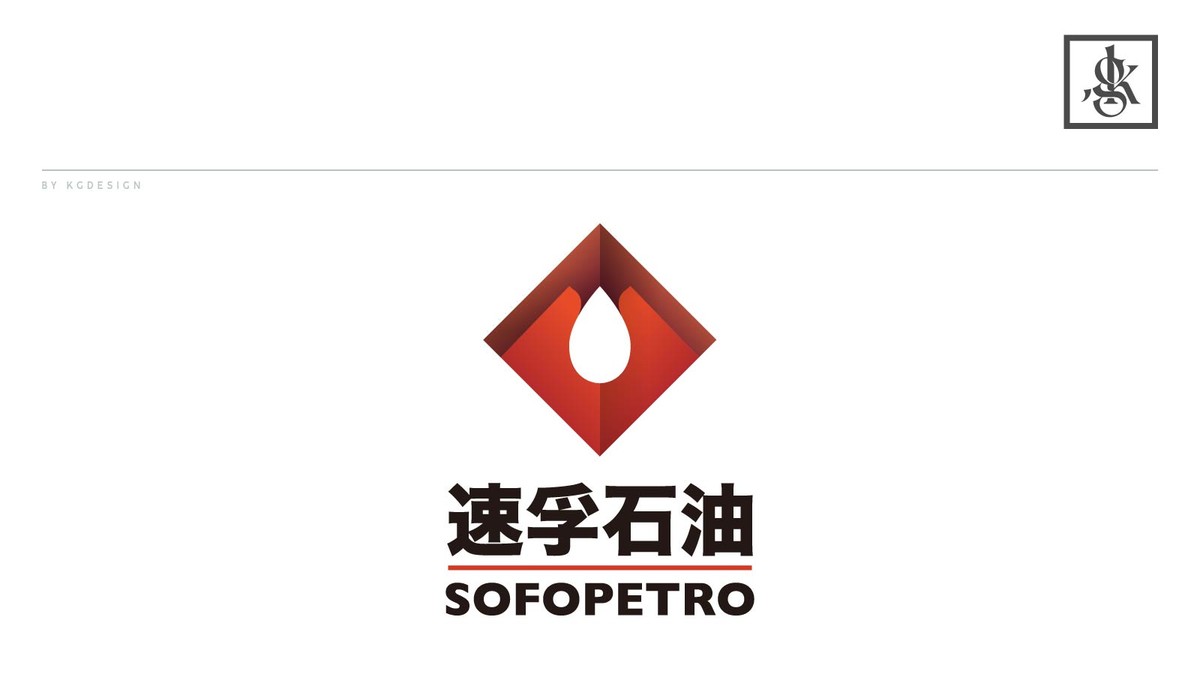
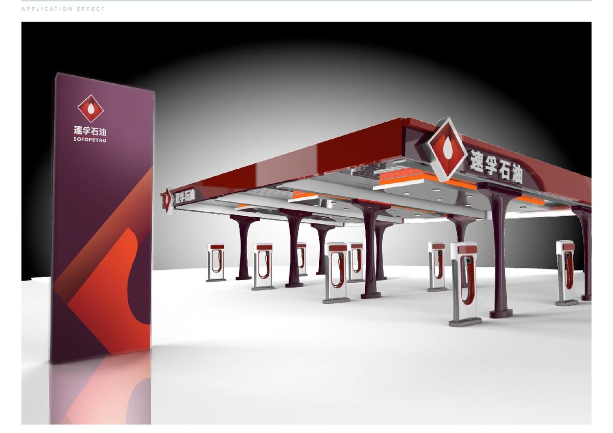
和大多数民营加油站不同,速孚石油并不甘心仅仅是将品牌打造成两桶油的替代品通过赚取油品批零差价来获取利润。而是希望将自己打造成集批发调度与零售为一体的综合油品企业。
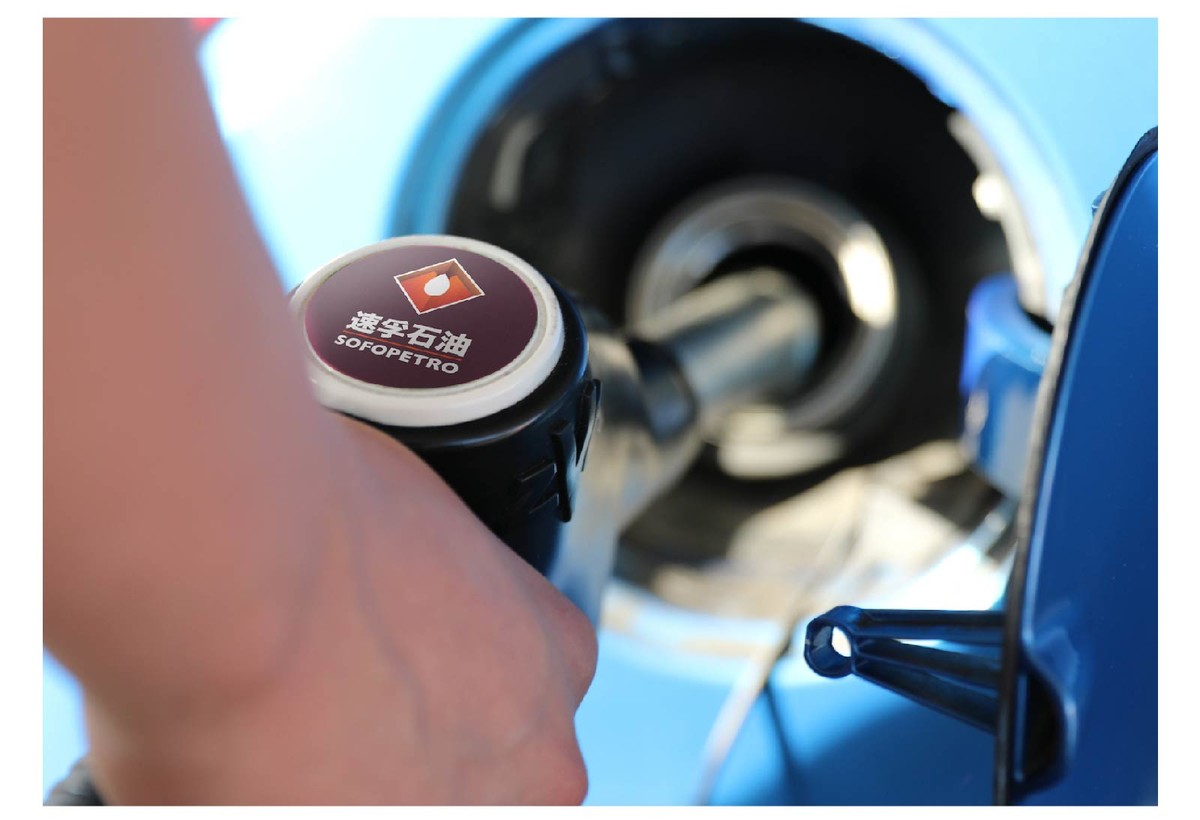
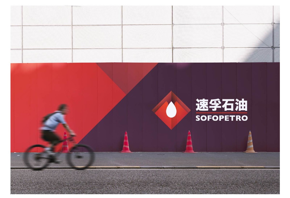
设计上为了加强识别性选择了基础几何图形中的矩形元素,双手捧起油滴的造型即表达了速孚对产品珍而重之的态度,类似祈祷的手型也寓意着速孚石油对所有消费者一路平安的祝愿。
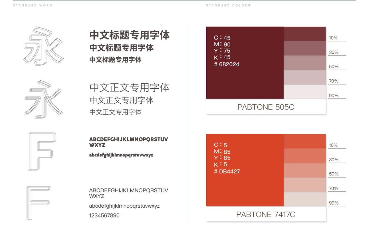
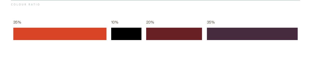
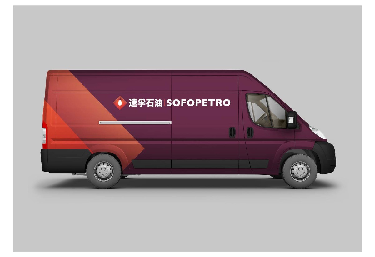
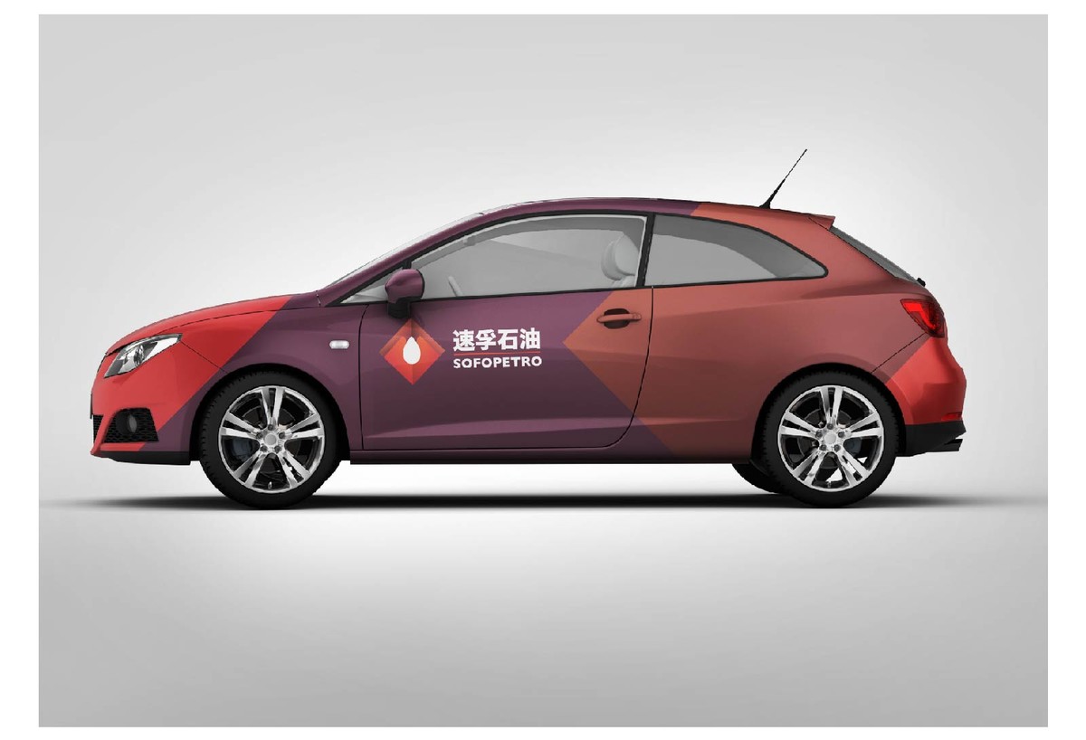
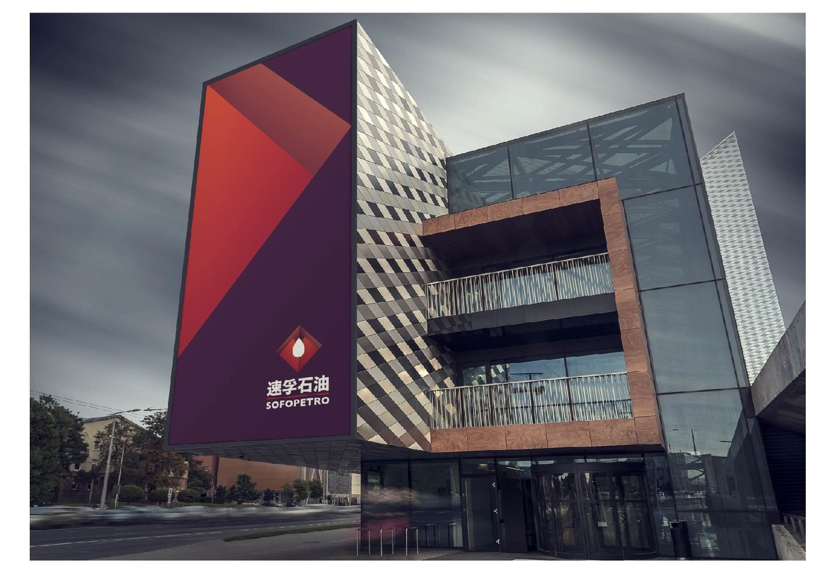
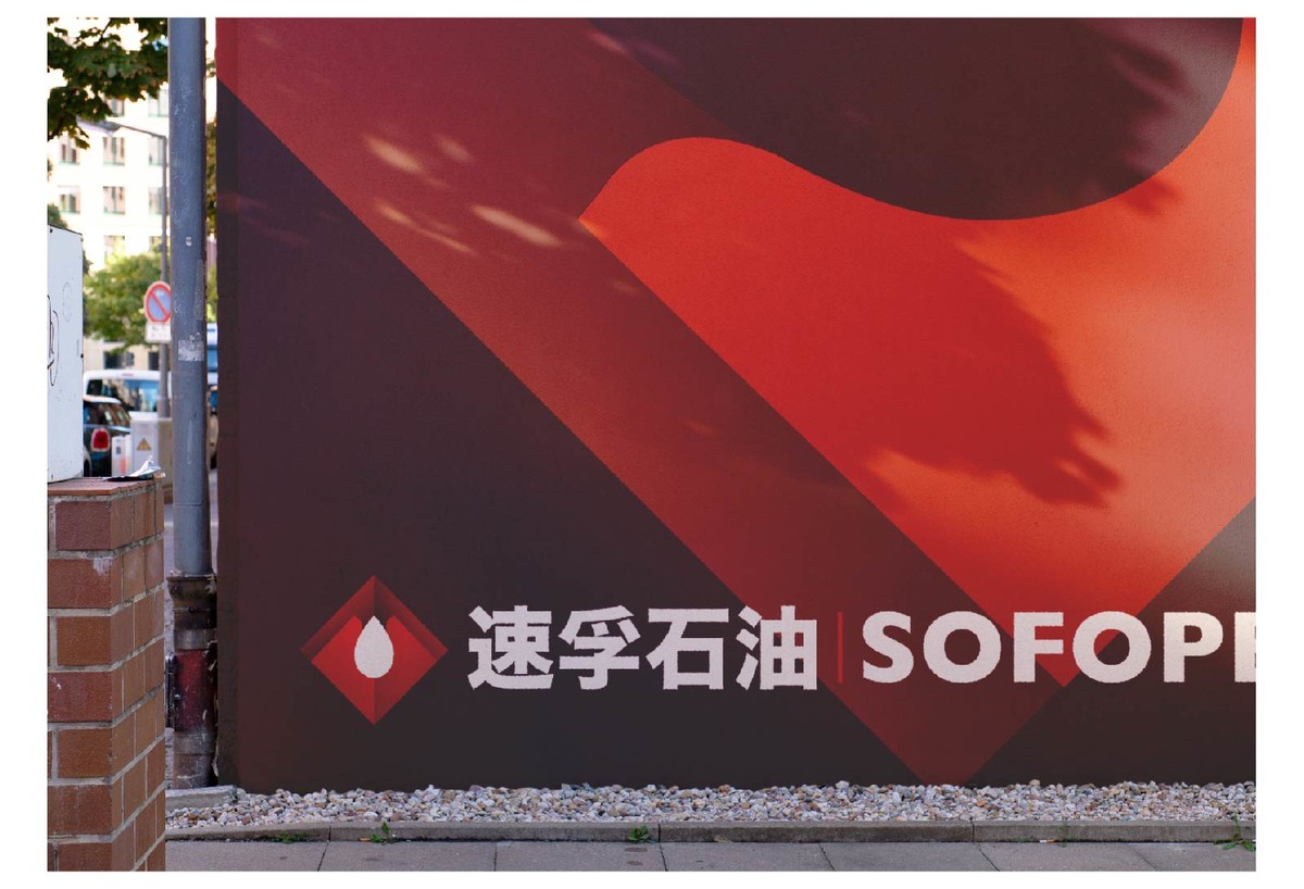
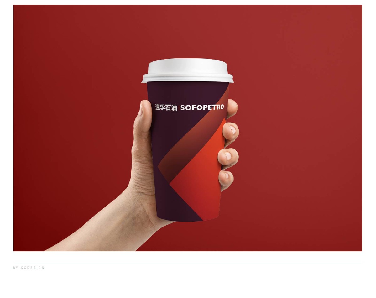
为了区别于两桶油,在配色设计中也特意规避了中石油的红黄配色与中石化的红白配色转而使用了更为浓郁醒目的红紫配色来进行展现。
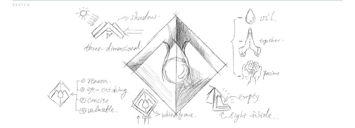

和大多数民营加油站不同,速孚石油并不甘心仅仅是将品牌打造成两桶油的替代品通过赚取油品批零差价来获取利润。而是希望将自己打造成集批发调度与零售为一体的综合油品企业。
设计上为了加强识别性选择了基础几何图形中的矩形元素,双手捧起油滴的造型即表达了速孚对产品珍而重之的态度,类似祈祷的手型也寓意着速孚石油对所有消费者一路平安的祝愿。
为了区别于两桶油,在配色设计中也特意规避了中石油的红黄配色与中石化的红白配色转而使用了更为浓郁醒目的红紫配色来进行展现。
