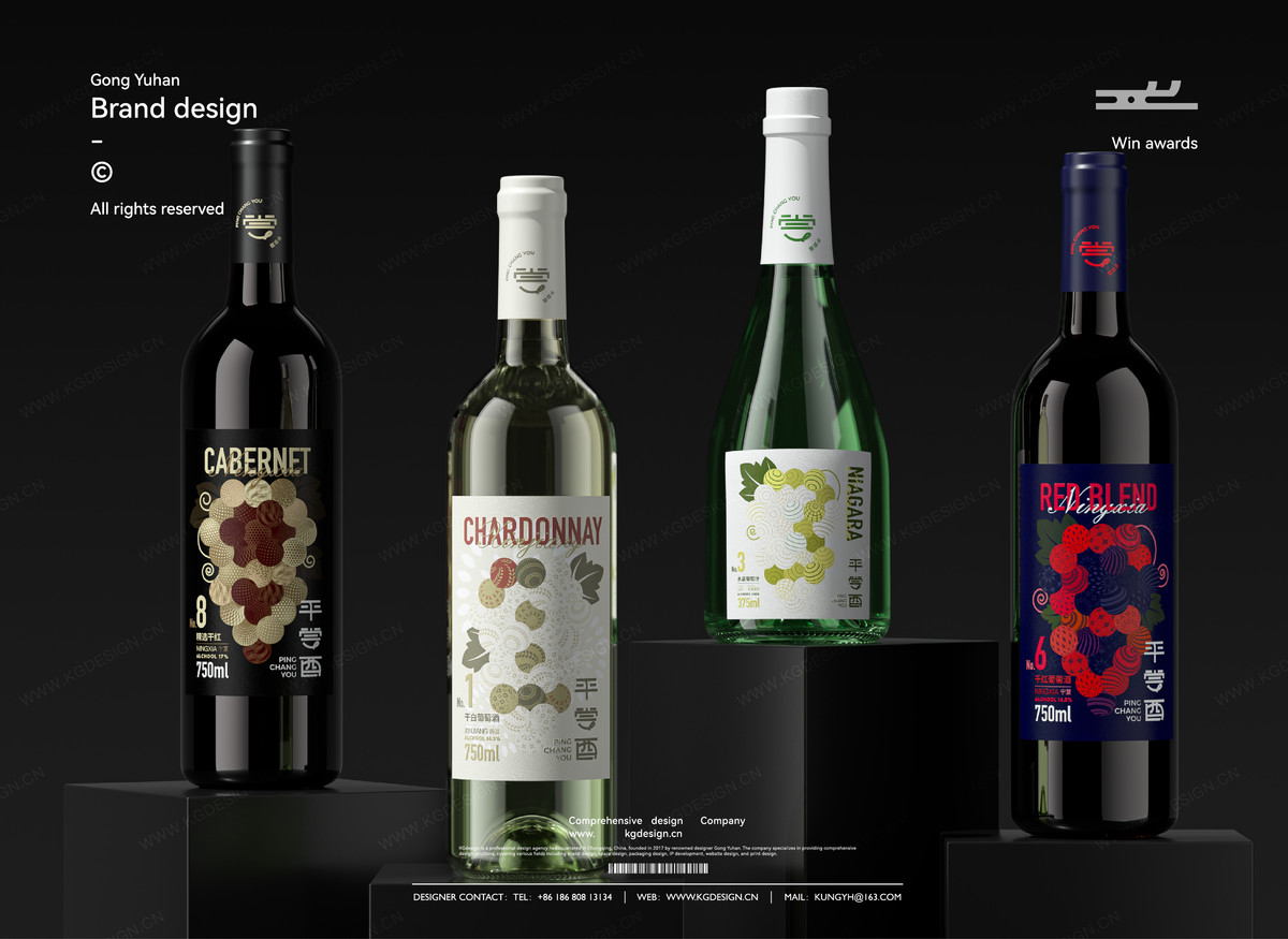
【我司案例】平尝酉|葡萄酒品牌包装设计
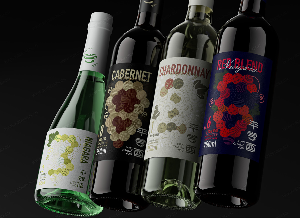
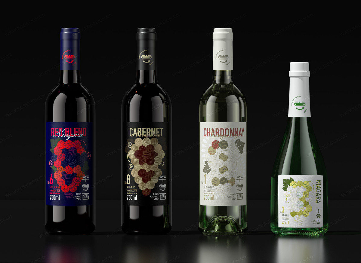
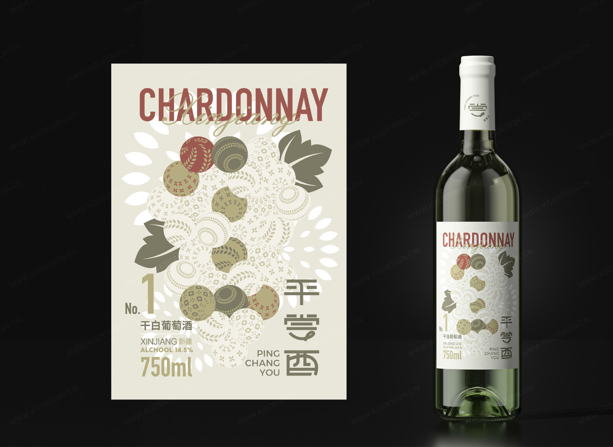
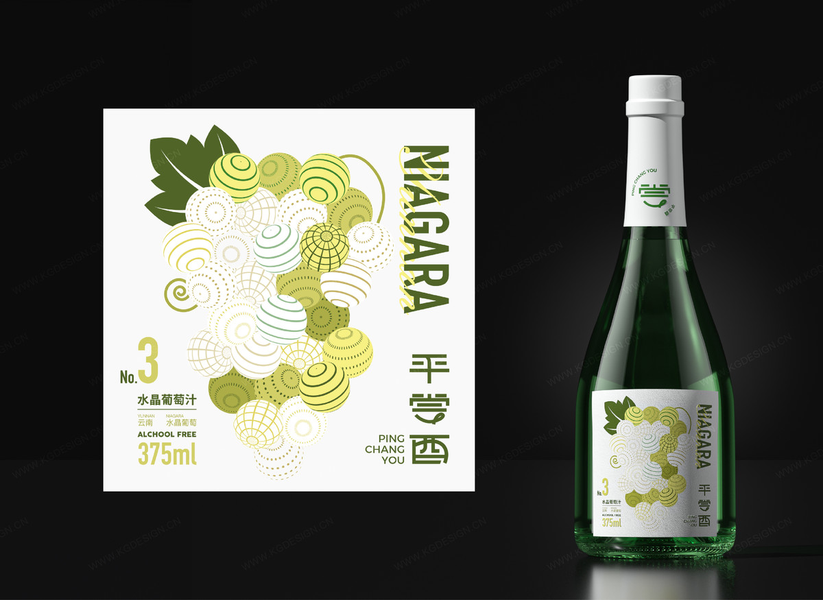
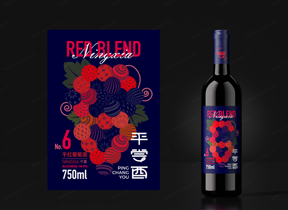
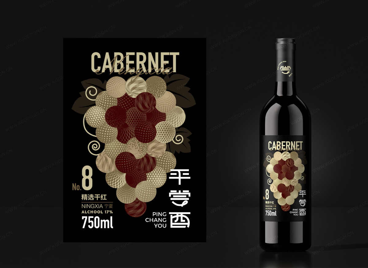
设计团队创造了独特的葡萄形球体框架,展现原材料的饱满与新鲜,并通过不同花纹准确表达各款葡萄酒的口感。我们还设计了基于此框架的数字系统,确保视觉一致性,同时方便消费者识别产品系列。
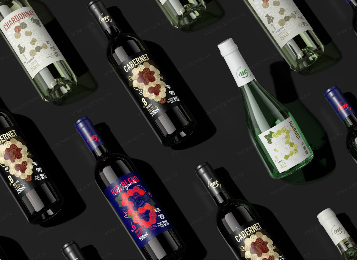
酒标设计成本低廉,吸引力强,打破了传统包装依赖昂贵材料和复杂工艺的惯例。通过首次应用独创的葡萄形格栅和数字编号,平尝酉在市场中脱颖而出。
整体而言,平尝酉的酒标设计以低成本、高吸引力的包装传达品牌价值,成功吸引年轻消费者,推动了葡萄酒在中国市场的普及。
The design team crafted a unique grape-shaped framework that highlights thefreshness of the ingredients, with different patterns representing the distinctflavors of each wine. We also developed a numbering system based on thisframework for easy identification of product series.
This low-cost yet attractive label design breaks from traditional reliance on expensive materials, using our original grape-shaped grid and numbering systemto make Pingchangyou stand out in the market.
In summary, Pingchangyou's label design effectively conveys the brand's value,attracting young consumers and promoting wine in the Chinese market with acost-efficient, visually appealing approach.